Pixie Pop Soda Branding
Pixie Pop Soda is a branding and packaging design project centered on creating a cohesive, candycore-inspired soda identity. Drawing from sparkling, cloud-like visuals and retro influences, the project includes logo development, typography exploration, color systems, and final product mockups, in Adobe Illustrator and Photoshop resulting in a fully realized and visually engaging brand.
Concept Development + Sketching
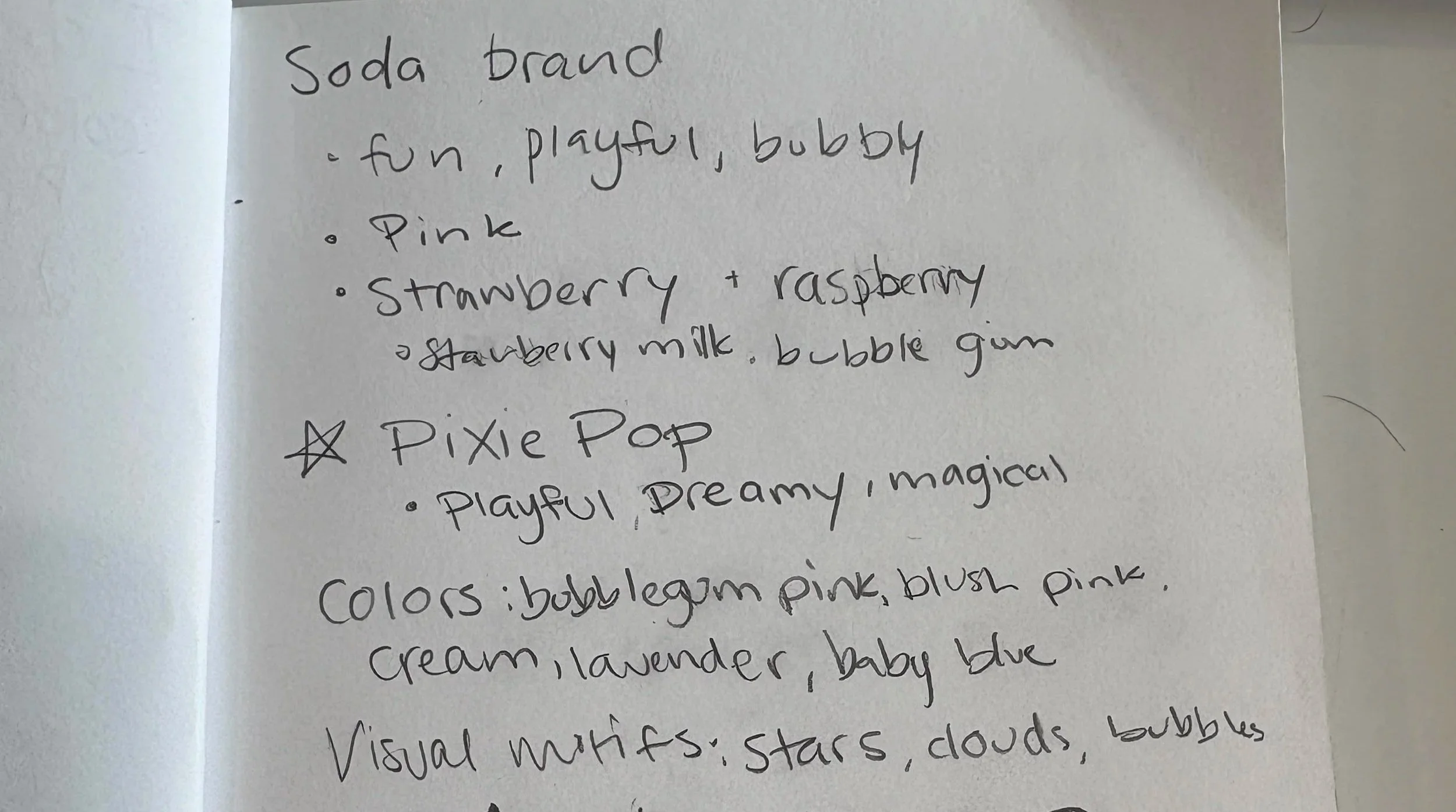
I began by exploring naming directions and brand personality, focusing on creating a soda brand that felt playful, nostalgic, and visually distinctive. I was drawn to themes of sparkle, clouds, and sweetness, which led to the final name Pixie Pop, a name that captures both the fizzy nature of soda and the brand’s whimsical tone.
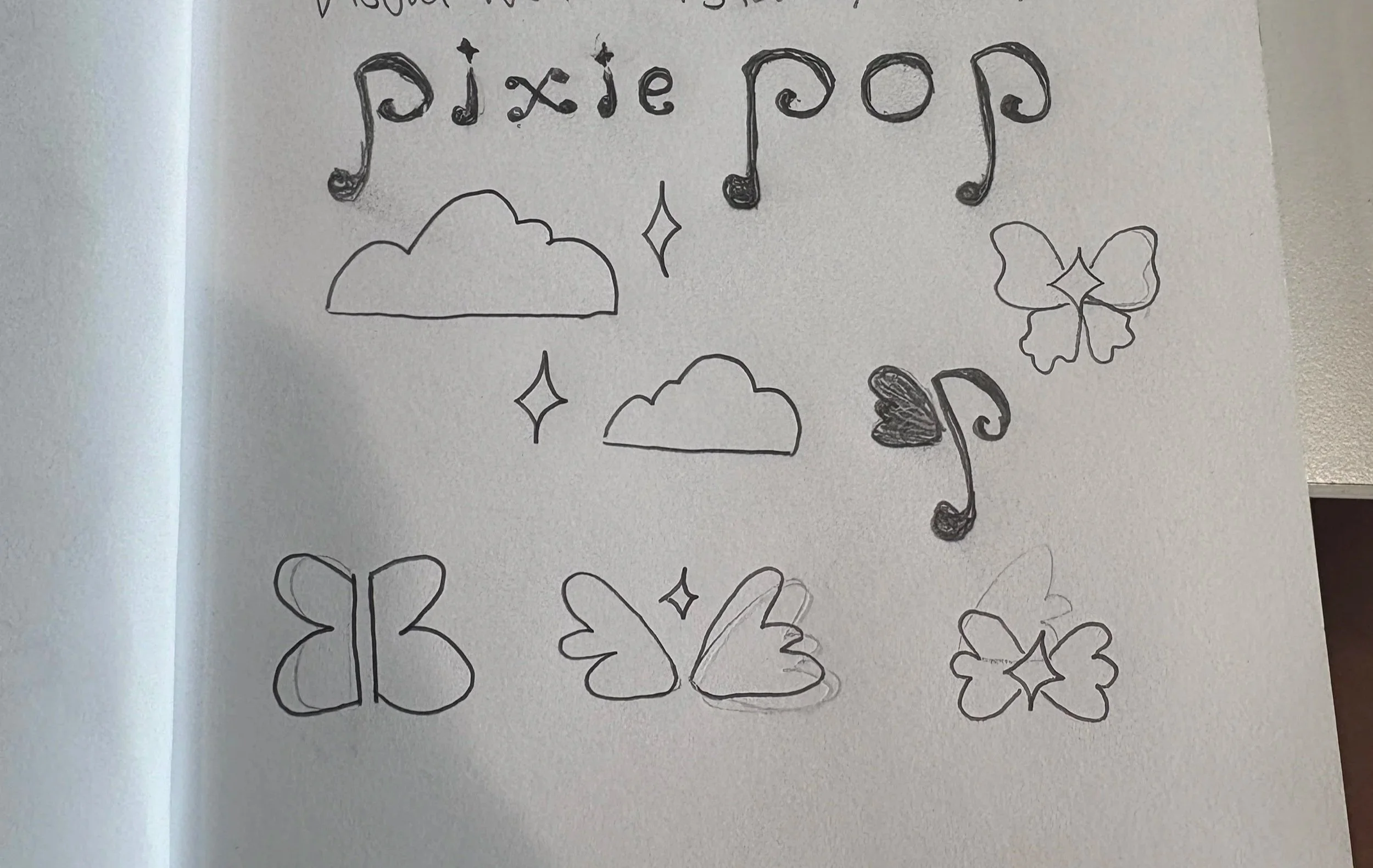
I sketched a range of logo concepts, experimenting with rounded, bubbly letterforms and playful iconography. I focused on creating movement and softness in the shapes to reflect the fizzy, lighthearted nature of the brand.
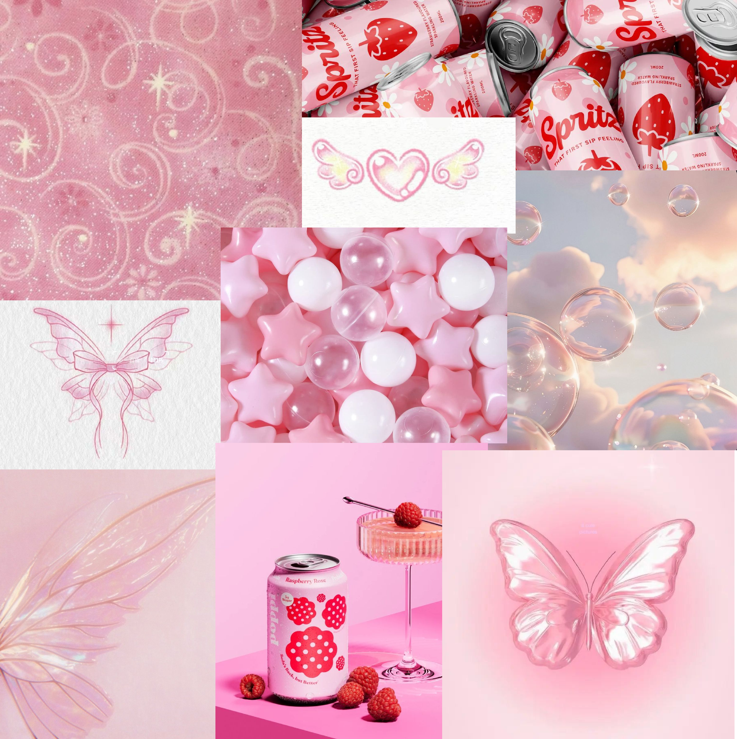
Moodboard
The moodboard focused on soft pink tones, cloud-like textures, and sparkling elements such as stars and bubbles. I also incorporated other fun and playful soda brands as references to ground the brand in a familiar visual language while keeping it modern and playful.
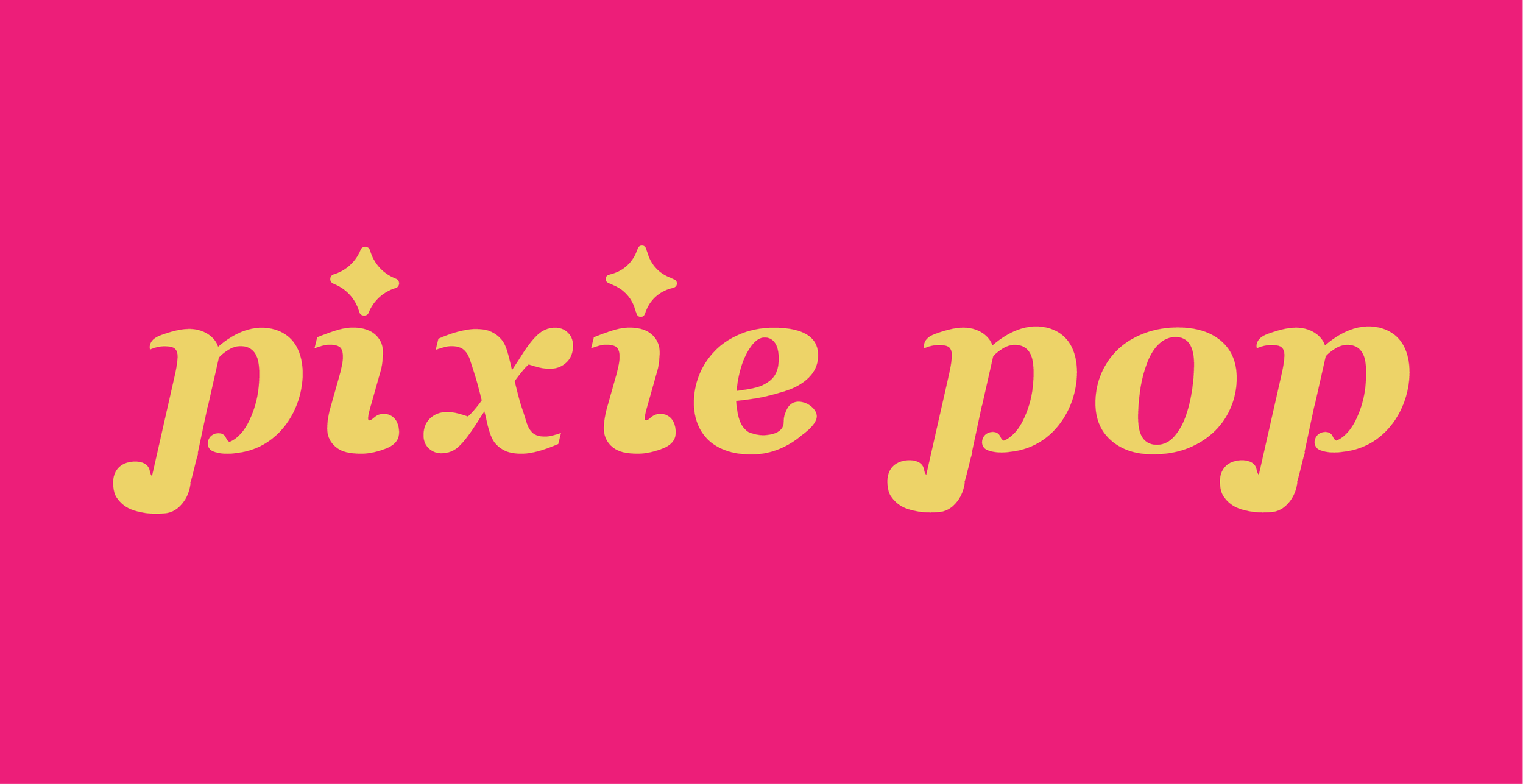
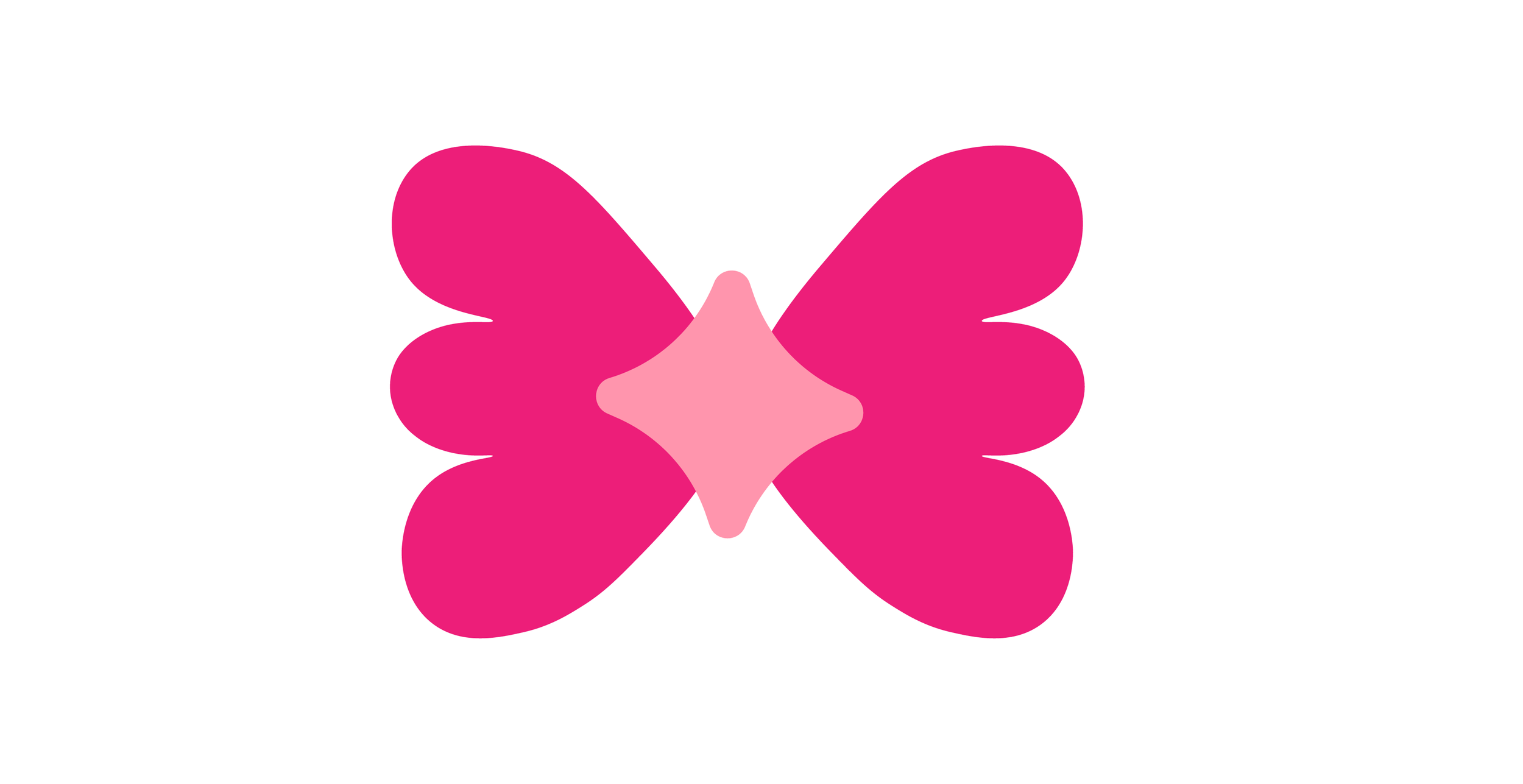
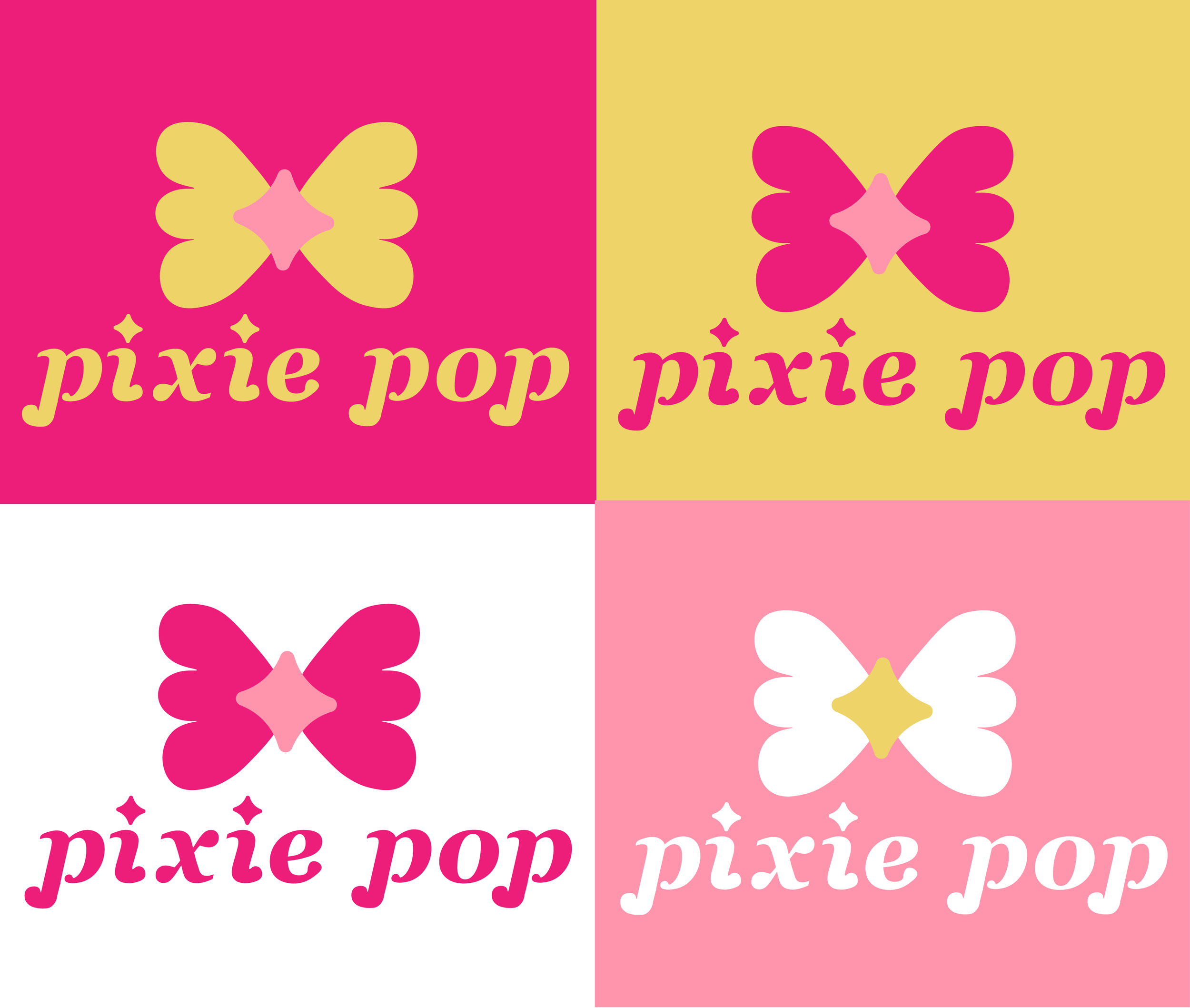
Logo Design & Typography
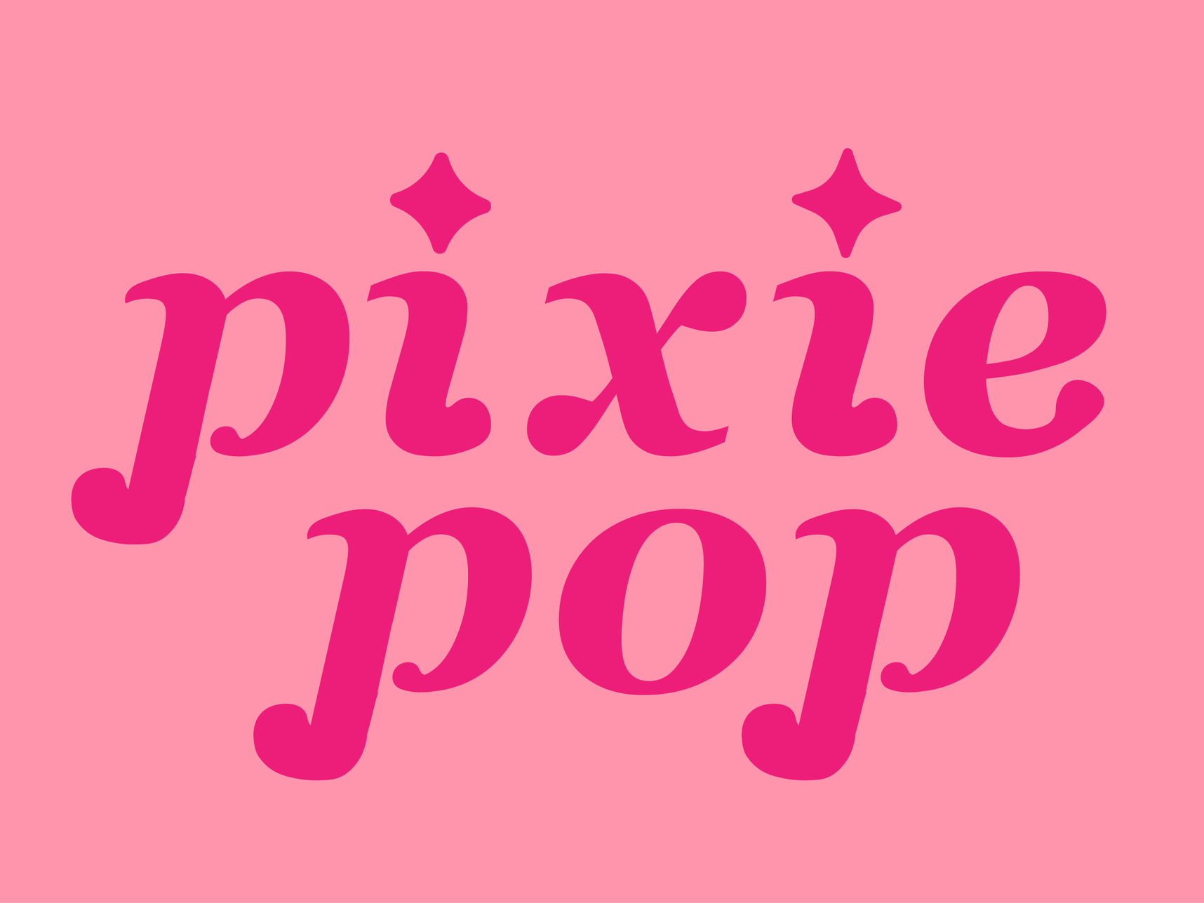
I developed a custom wordmark by modifying a base typeface to create softer, rounded forms that mimic the look of bubbles and to fit the tone of the brand.
I designed a simple pictorial mark inspired by sparkling elements and wings, reinforcing the brand’s dreamy identity and the pixie motif.
The combination mark integrates the wordmark and icon into a cohesive system that can be used flexibly across packaging and branding materials.

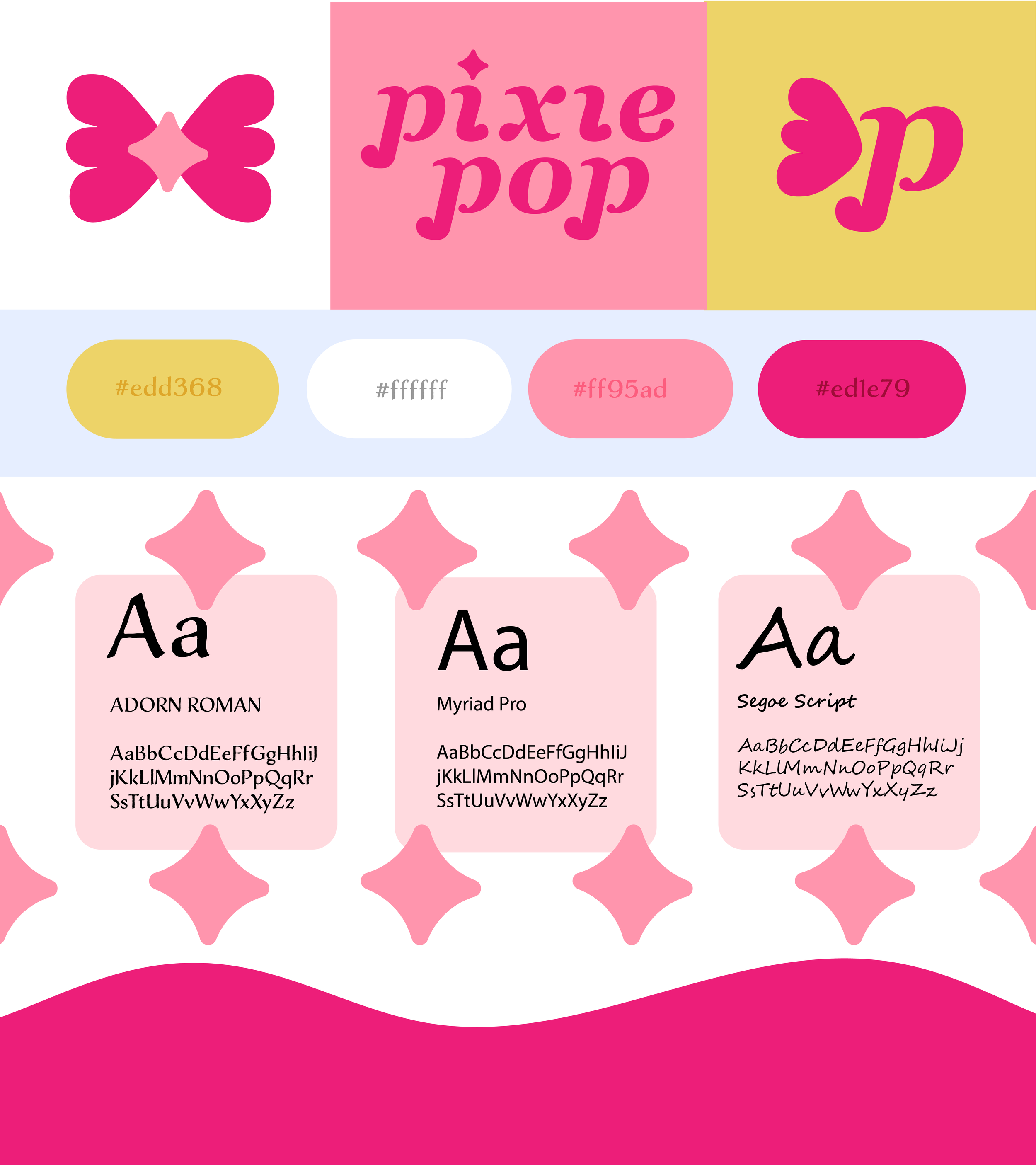
Style Guide
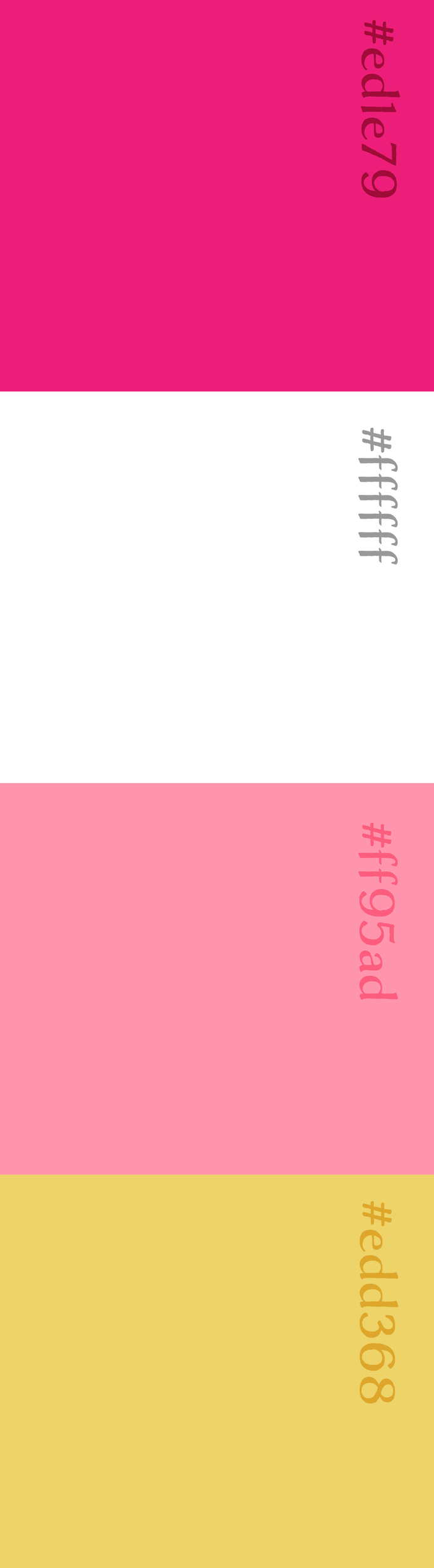
I created a style guide to ensure consistency across all brand applications, defining logo usage, color palette and hierarchy, and typography standards.
I also added an additional guide on different ways to match the colors in the logo and they all work together
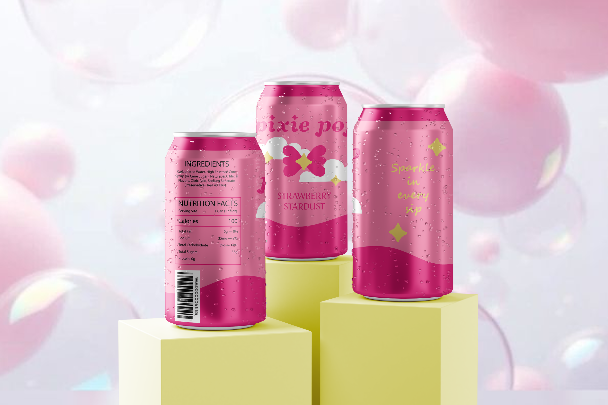
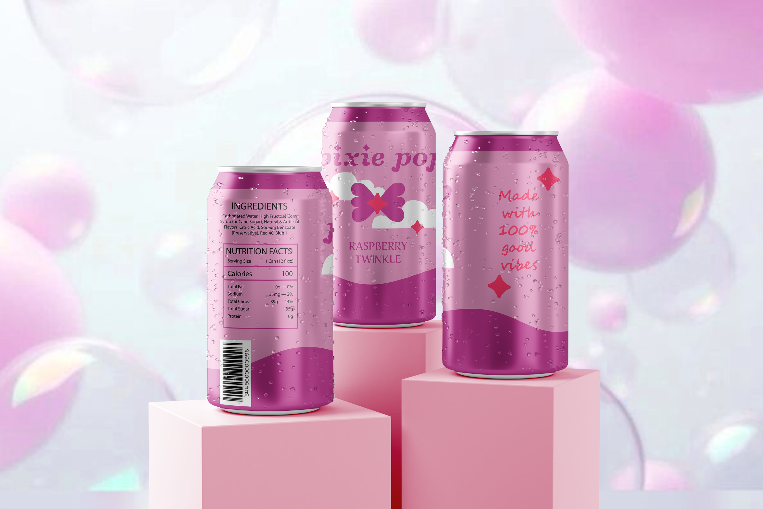
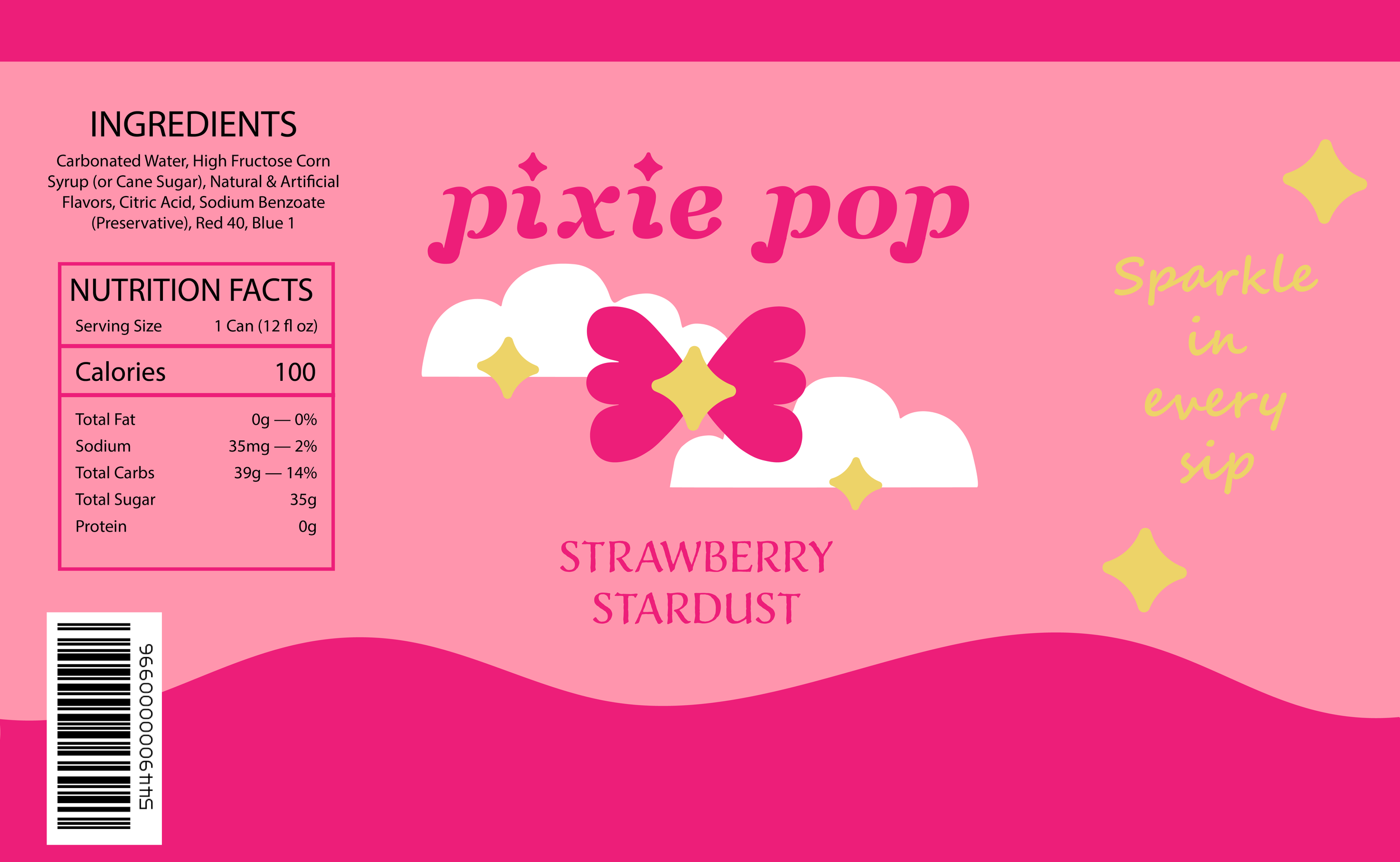
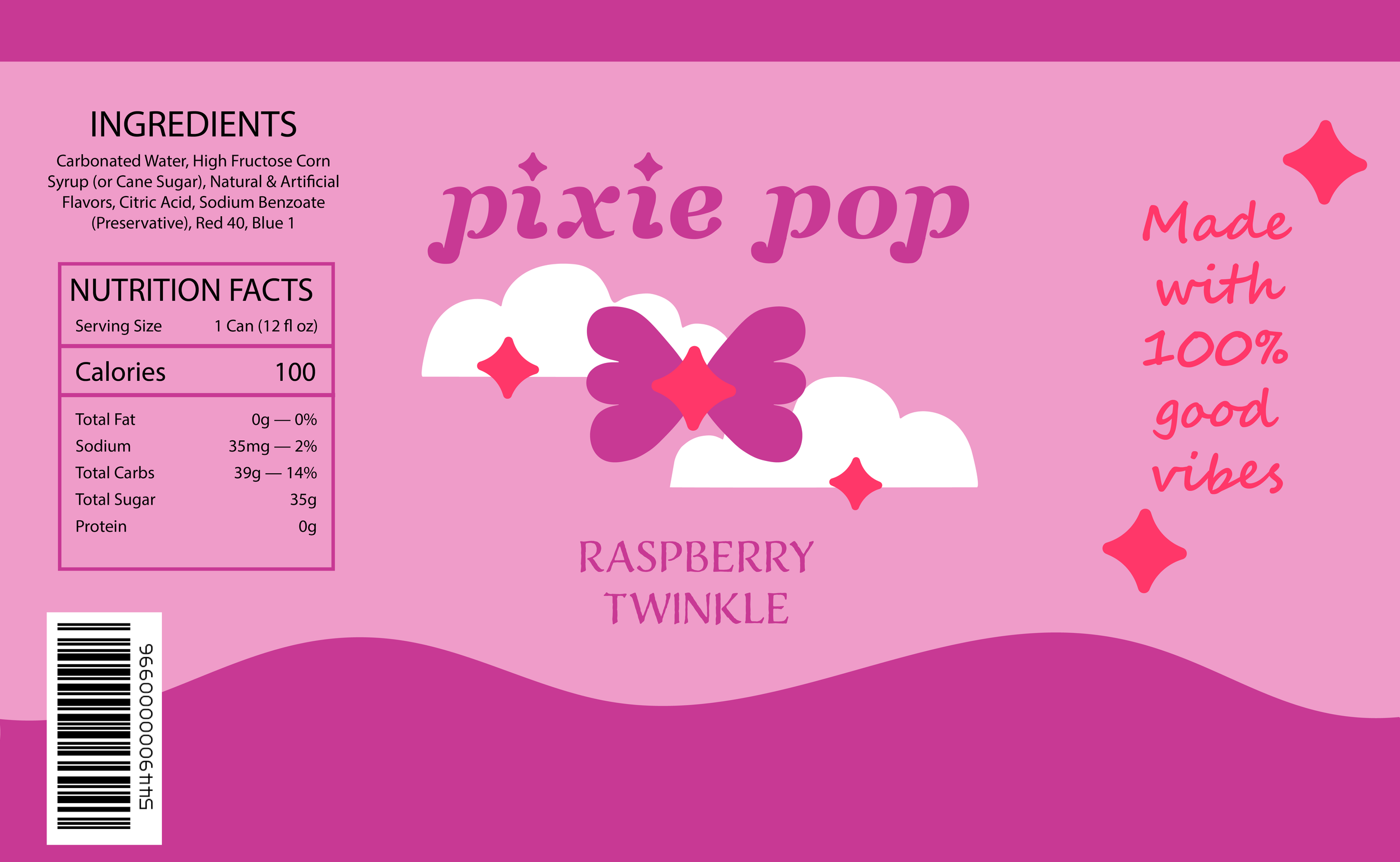
Packaging Design
I designed the soda can packaging to reflect the brand’s whimsical and fun identity through color blocking, sparkling details, and playful typography, adding in clouds to strengthen the visual identity
The Strawberry Stardust flavor uses a pink-toned palette with yellow accents with star elements to visually represent the flavor concept.
The other flavor, Raspberry Twinkle, uses the same basic structure, but the colors are adjusted to match the flavor. For this flavor, I decided to go with a pastel purple and dark pink accents in order to still feel cohesive with the rest of the brand
Mockups
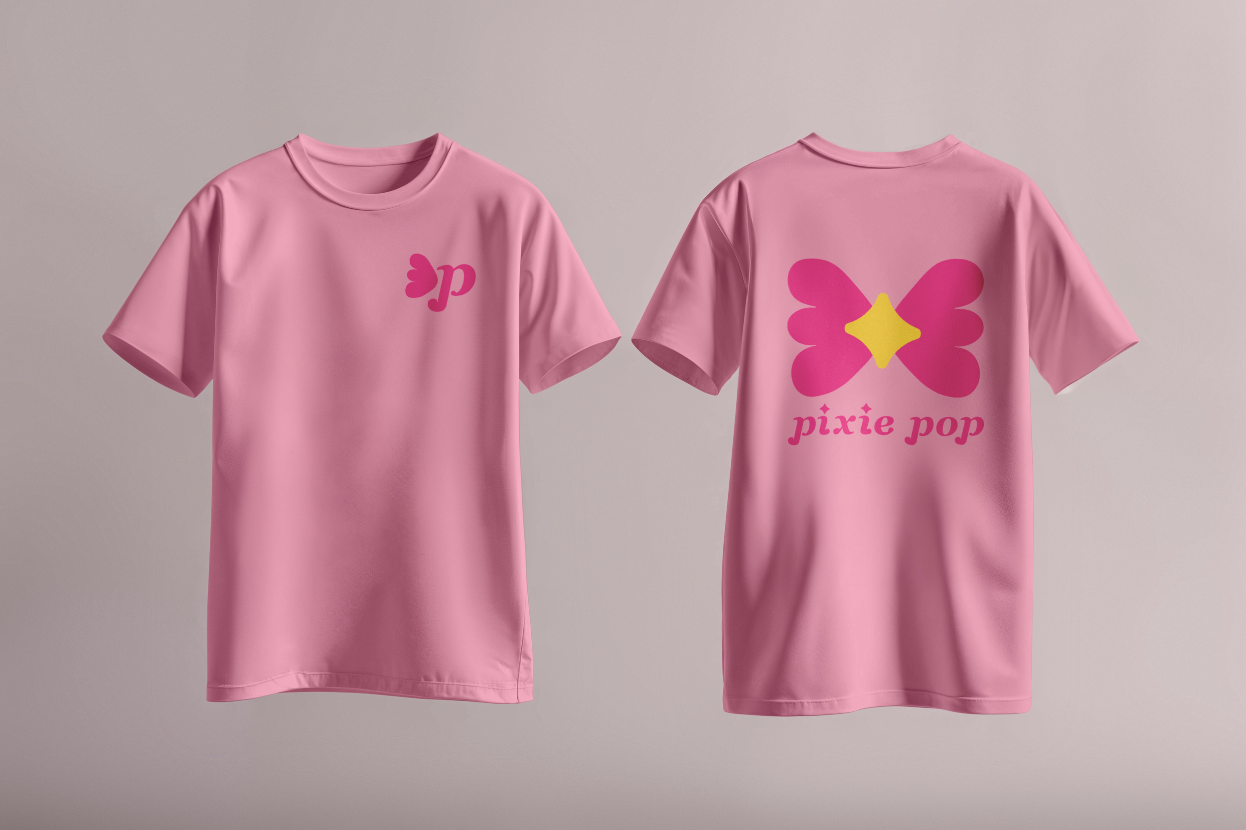
I applied the final designs to realistic mockups of soda cans to visualize how the product would appear in a retail environment. I also applies the logo to a t-shirt to see how the brand would look in different mediums and contexts